


In the previous blog, Flexbox Part 1, we discussed the basics of Flexbox and if you are not comfortable with it. I want you to refer to my Part 1 for a clear understanding of the basics before moving ahead.
Simplifying CSS: Flexbox Part 1
Now with the basics clear, it's time to dive a little deeper into understanding various powerful Flexblox properties with flex-direction: row to create responsive web layouts.

May the Flex Force be with you.
A quick recap of our representation
1) Flex Direction Row
By default the flex-direction is set to row (horizontal), starting from LHS to going RHS. That's how the above items are placed from left to right. So there isn't any need to add flex-direction: row to the container.
Note: I am adding flex-direction: row here to avoid any future confusion.
.container {
display: flex;
flex-direction: row;
}
1.1) Justify Content
We can change how items are distributed along the Main Axis using the justify-content property. In the case of flex-direction: row, the Main Axis is from Left to Right (horizontal) :
.container {
display: flex;
flex-direction: row;
justify-content: flex-start; /*flex-end, center, space-around, space-between, space-evenly */
}
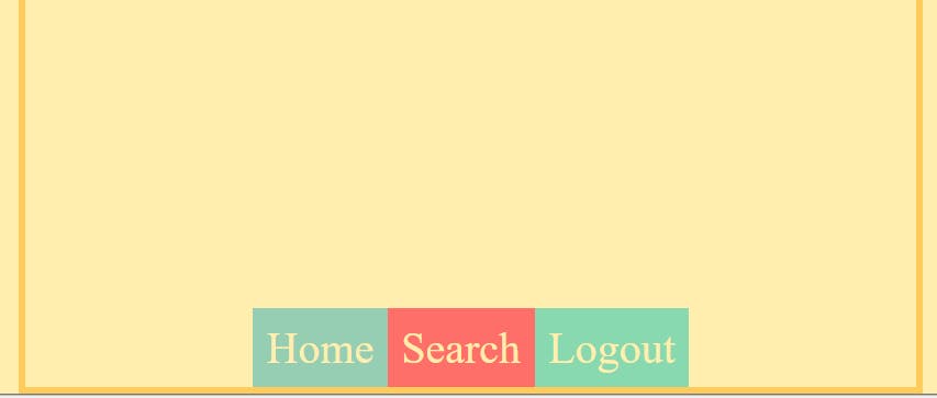
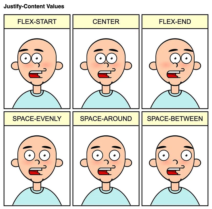
a) justify-content: flex-start (by default), all items are sticking at the start of the Main Axis.

b) justify-content: flex-end, all items are sticking at the end of the Main Axis.

c) justify-content: center, all items will stick at the center of the Main Axis.

d)justify-content: space-around, it provides enough space between each item on LHS and RHS (items don't stick at any ends of the Main axis).

e)justify-content: space-between, it provides an equal space between each item (items stick at the ends of the Main axis)

f)justify-content: space-evenly, it provides even space between the items and the end of the Main Axis on both sides.

NOTE:
If you observe all the images a bit more, you'll realize that in particular the items are not aligned individually but as a group.
When it comes to the Main axis, we don't generally think in terms of aligning a single item. Instead, it's all about the distribution (the content) of the group (container).
We can place all the items together in a particular location (with flex-start, center, and flex-end), or we can spread them apart (with space-between, space-around, and space-evenly).
1.2) Align Items
For the Cross Axis, things are a bit different. We use the align-items property to align items across the Cross Axis. In the case of flex-direction: row, the Cross Axis is from Top to Bottom (vertical) :
Before diving into Cross Axis, let's do a code review first
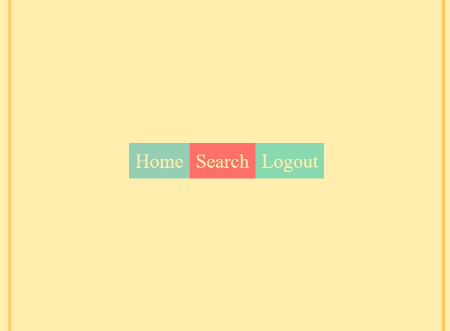
<html>
    <head>
        <h1>Flexbox Part 2</h1>
    </head>
    <body>
        <div class="container">
            <div class="home">Home</div>
            <div class="search">Search</div>
            <div class="logout">Logout</div>
        </div>
    </body>
</html>
div with class ="container" is the Flex Container or Container.
html, body {
 height: 100%;
}

.container{
    display: flex;
    flex-direction: row;
    height: 100%;
    align-items: stretch;
}
height of html, body, and container is 100%.
Now applying align-items properties
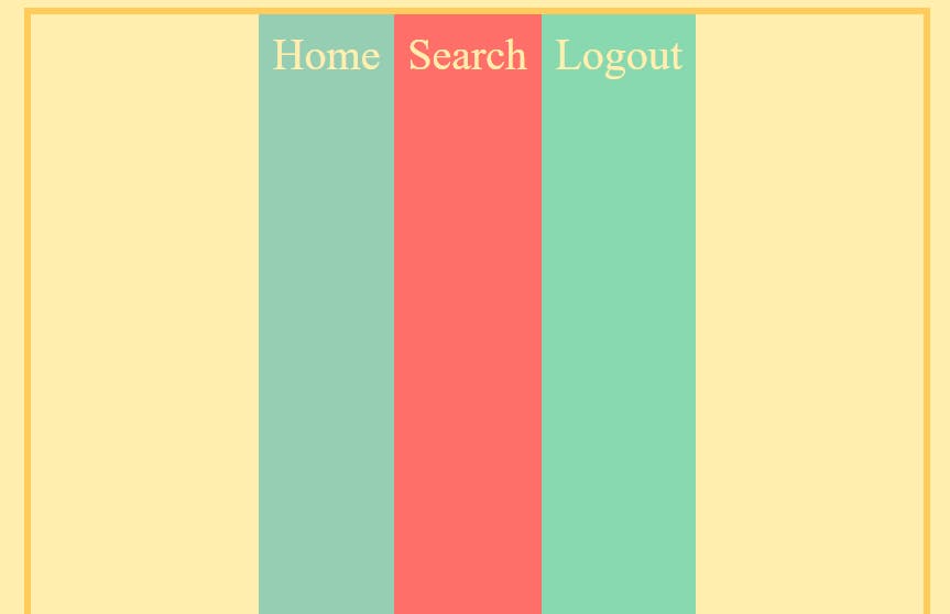
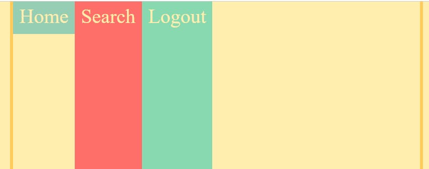
a) align-items: stretch, by default, makes all the items stretch across the Cross Axis, we can see this by increasing the height of the container with height: 100%
NOTE: height: 100% only works when html, body height: 100% otherwise it will be the default height of the container(the minimum height required to fit all items)
b)align-items: baseline, makes all the items align along their content's baseline.
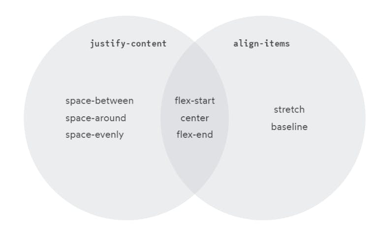
Another interesting observation, with align-items, we have some of the same options as justify-content, but there isn't a perfect overlap.
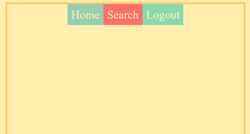
c) align-items: flex-start, all items stick to the start of the Cross Axis and only take as much height as they are required to display their content.
d) align-items: flex-end, all items stick to the end of the Cross Axis and only take as much height as they are required to display their content.
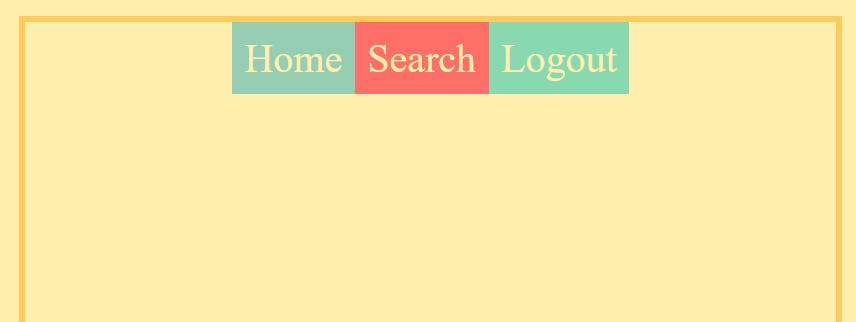
e) align-items: center, all items stick at the center of the Cross Axis.

2) Positioning Items Individually
2.1) Along the Cross Axis
align-self property allows us to change the alignment of a specific item along the Cross Axis.
.container{
    display: flex;
    flex-direction: row;
    height: 100%;

}
.home{
    align-self: flex-start; /*flex-end, center, stretch, baseline */
}
NOTE: container height: 100%
I am going to modify the Home item by targeting its class '.home' with all types of align-self properties. In fact, align-self has all the same values as align-items. They change the exact same thing. align-items is a convenient shortcut that automatically sets the alignment on all the items at once.
Items take only as much space as they are required to display their own content.
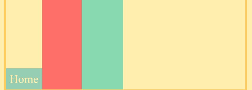
a) align-self: flex-start, aligns the item to the start of the Cross Axis.
b) align-self: flex-end, aligns the item to the end of the Cross Axis.
c) align-self: center, aligns the item to the center of the Cross Axis.

the same applies to align-self: stretch and align-self: baseline for the Home as mentioned in the align-items property.
2.2) Along the Main Axis
NOTE: Unlike for Cross Axis, we have align-self but for the Main Axis, there is no justify-self*. To unravel this mystery, we will dive deeper into the Flexbox mechanism after a short while.
To position items individually along the Main Axis we use the traditional margin-left or margin-right property by targeting it by using the respective class names of the items.
a) margin-left: auto, places an element at the end of the Main Axis (puts a margin from the left side)
.logout{
    margin-left: auto;
}

b) margin-right: auto, places an element at the start of the Main Axis (puts a margin from the right side)
.home{
    margin-right: auto;
}
Other values of margin-left or margin-right can also be used such as in px or rem
NOTE: The margin-left and the margin-right property also affects other items besides the item on which they are applied.
.search{
    margin-left: auto
}

As you can see margin-left: auto makes Search at the end of the Main Axis, but since Logout is also after Search, it also gets pushed to the end of the Main Axis.
3) Content v/s Items
So, based on what we've learned so far, Flexbox might seem pretty confusing.
Why is it justify-content and align-items, and not justify-items, or align-content?
For that matter, why is there an align-self, but not a justify-self?
These questions get at one of the most important and misunderstood things about Flexbox, and it's finally time to unravel these mysteries.
I will do so by taking a few metaphors
For Main Axis - Beads
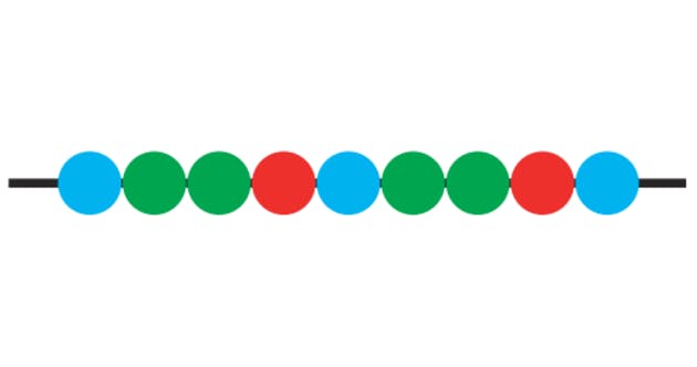
In Flexbox, items are distributed along the Main Axis. By default, they're nicely lined up, side-by-side. I can draw a straight horizontal line (Main Axis) 'the string' and all of the items, like beads.
For Cross Axis - Nutbolts
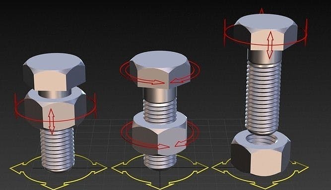
Unlike the Main Axis, the Cross Axis is a bit different. Here each nut is an item and each Bolt (Cross Axis) will only intersect one nut.
Observe that there's a significant difference here. With the Nutbolts, each item can move along its bolt (Cross Axis) without interfering with any of the other nuts (items)
By contrast, with our Main Axis, a single item (bead) can’t move along its string without bumping into other beads.
This is the fundamental difference between the Main and Cross Axis. When we align items in the Cross Axis, each item can be placed anywhere. In the Main Axis, though, we can only think about how to distribute the group.
That's why there's no justify-self. What would it mean for that any middle piece to set justify-self: flex-start? as there's already another piece there!
With all of this context in mind, let's give a proper definition to all 4 terms we've been talking about:
justify— to position something along the Main Axis.align— to position something along the Cross Axiscontent— a group of “stuff” that can be distributed.items— single items that can be positioned individually.
And so: we have justify-content to control the distribution of the group along the Main Axis, and we have align-items to position each item individually along the Cross Axis. These are the two main properties we use to manage layout with Flexbox.
There are no justify-items for the same reason that there are no justify-self; when it comes to the Main Axis, we have to think of the items as a group, as content that can be distributed.
4) Centering: The Game Changer
We have been discussing centering content along the Main Axis, and items along the Cross Axis via justify-content: center and align-items: center
But what if, one wants to center their content/item exactly at the center of the Flexbox container?
It's where the magic of Flexbox arrives. Both justify-content: center and align-items: center can be combined in the parent container to give the most satisfying feeling of centering an item.
.container{
    display: flex;
    flex-direction: row;
    height: 100%;
    justify-content: center;
    align-items: center;
}
5) Conclusion
1) justify-content - aligns content along the Main Axis.
2) align-items - aligns items along the Cross Axis.
3) align-self - aligns individual items along the Cross Axis.
4) justify — to position something along the Main Axis.
align— to position something along the Cross Axiscontent— a group of “stuff” that can be distributed.items— single items that can be positioned individually.
5) To center exactly at the center of the container justify-content: center and align-items: center.
This was all for Flexbox Part 2. Here we explored properties with flex-direction: row Do practice these code snippets and try experimenting with different properties to get a better grasp of Flexbox. You aren't a true developer if you don't practice to satisfy your curiosity.
In the next blog Flexbox Part 3, we will flash through the properties of flex-direction: column and explore it.