


With an understanding of Flexbox properties involved with flex-direction: row from Flexbox Part 2, it's time to explore the ways of the flex-direction: column
If you haven't checked my previous Flexbox Part 2, do so cause it will be helpful ahead.
Simplifying CSS: Flexbox Part 2
1) Flex Direction Column
<html>
<head>
<title>Flex Direction Column</title>
</head>
<body>
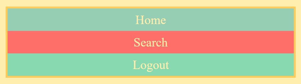
<div class="container">
<div class="home">Home</div>
<div class="search">Search</div>
<div class="logout">Logout</div>
</div>
</body>
</html>
Here's our Flex Container, and the height of the HTML, body, and container is 100% for understanding the flex properties better.
.container{
    display: flex;
    flex-direction: column;
}
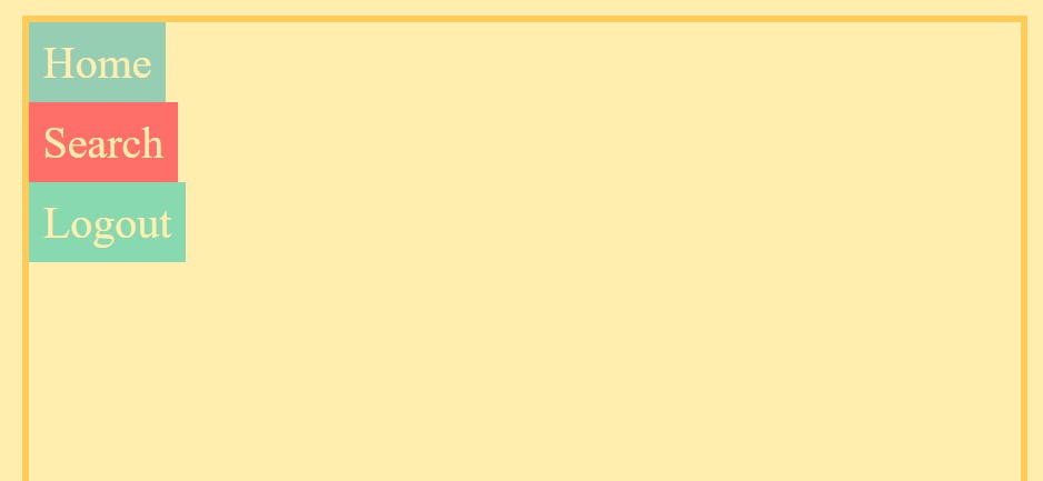
Setting the flex-direction: column, stacks the flex items from top to bottom inside the flex container.
NOTE: As already mentioned before, the Two Axes now interchange when the flex-direction is set to column, the Main Axis is Top to Bottom (vertical) and the Cross Axis is Left to Right (horizontal).
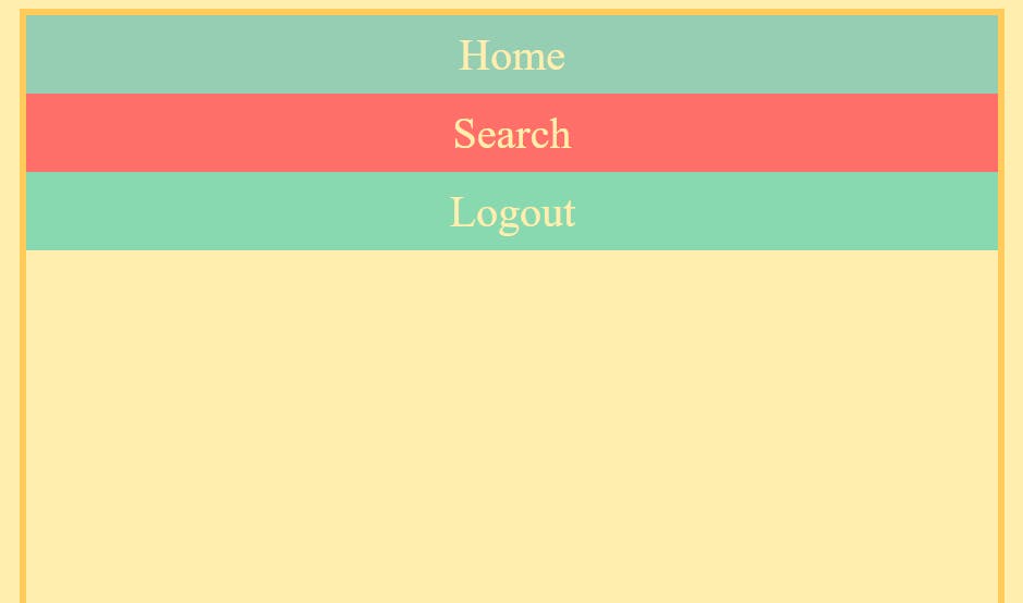
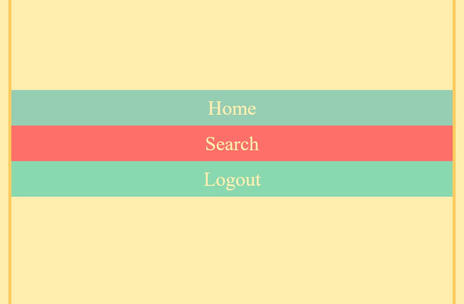
1.1) Justify Content
As usual, we can change how items are distributed along the Main Axis using the justify-content property. In the case of flex-direction: column, the Main Axis is from Top to Bottom (vertical).
.container {
    height: 100%;
    display: flex;
    flex-direction: column;
    justify-content: flex-start; /*flex-end, center, space-around, space-between, space-evenly */
}
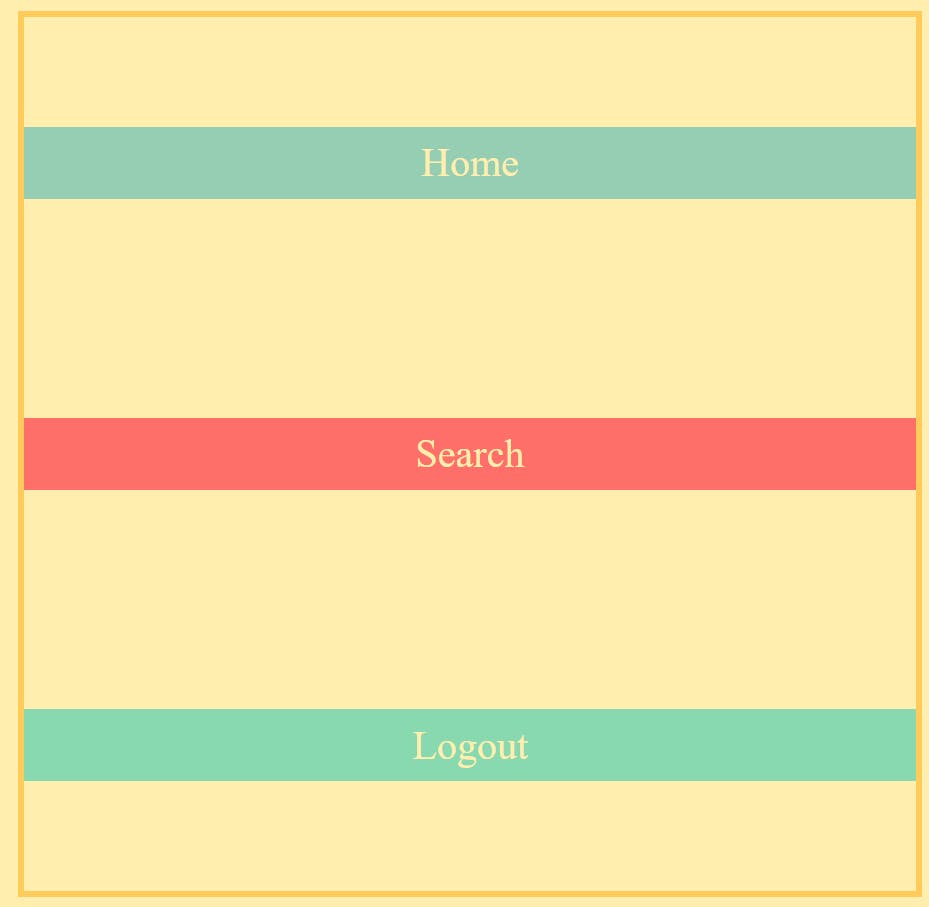
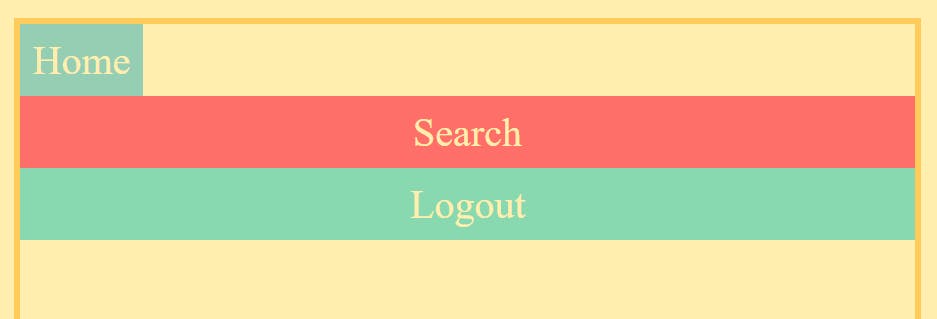
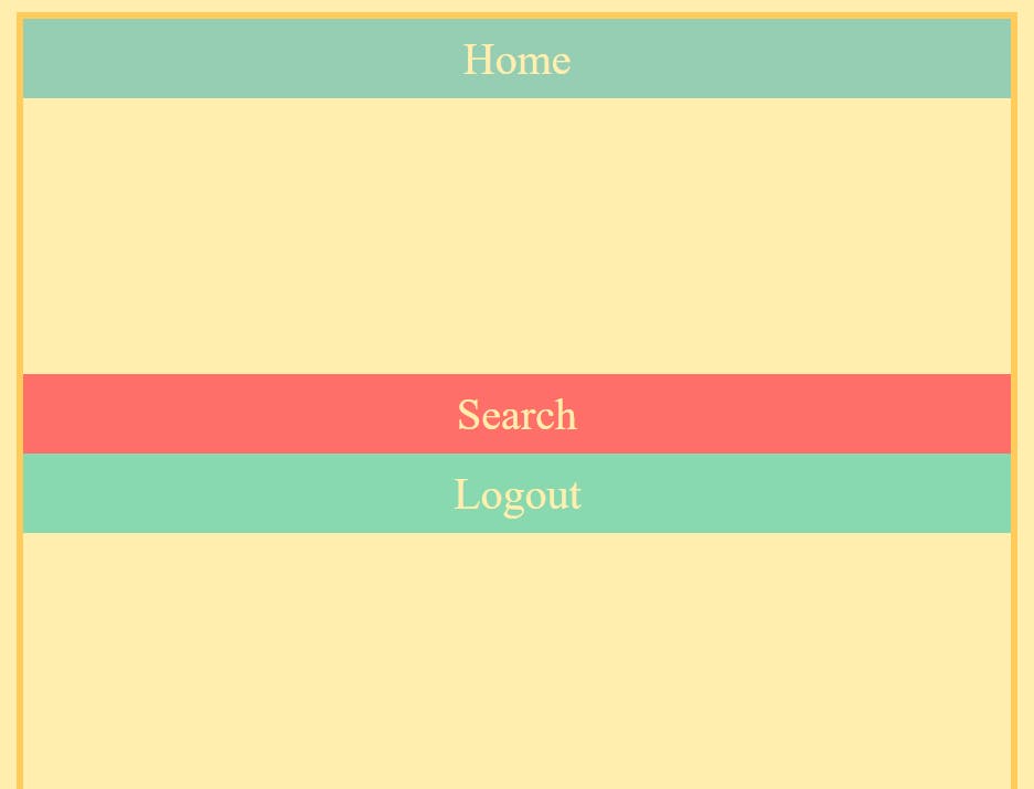
a) justify-content: flex-start (by default), all items are sticking at the start of the Main Axis.
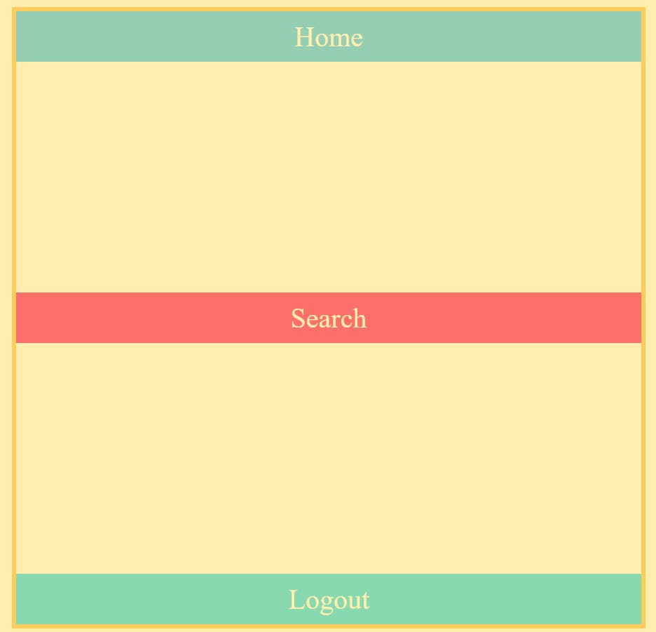
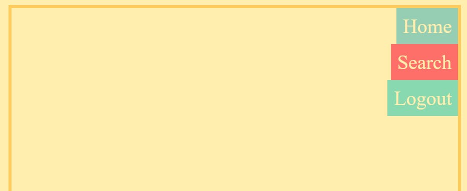
b) justify-content: flex-end, all items are sticking at the end of the Main Axis.

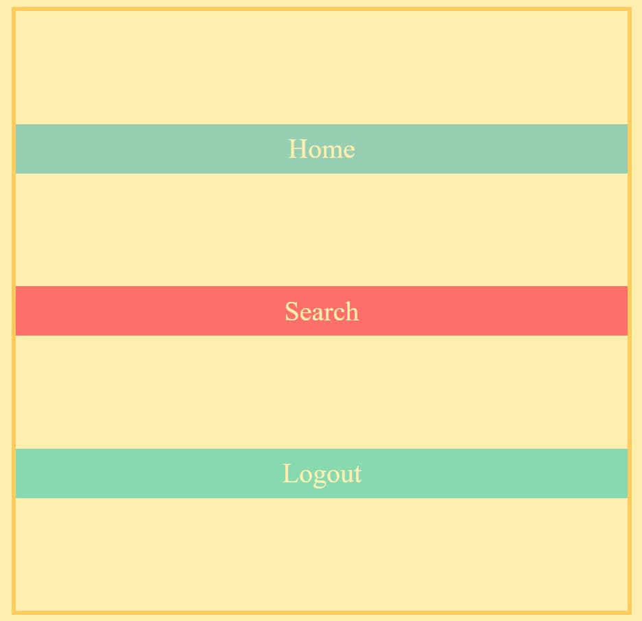
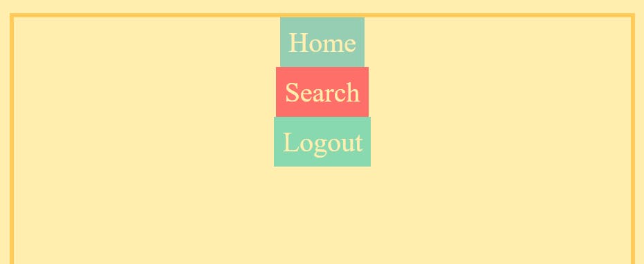
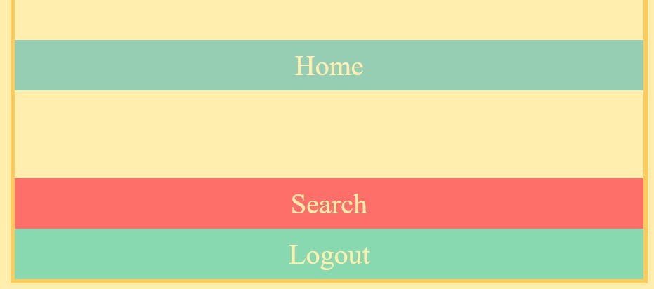
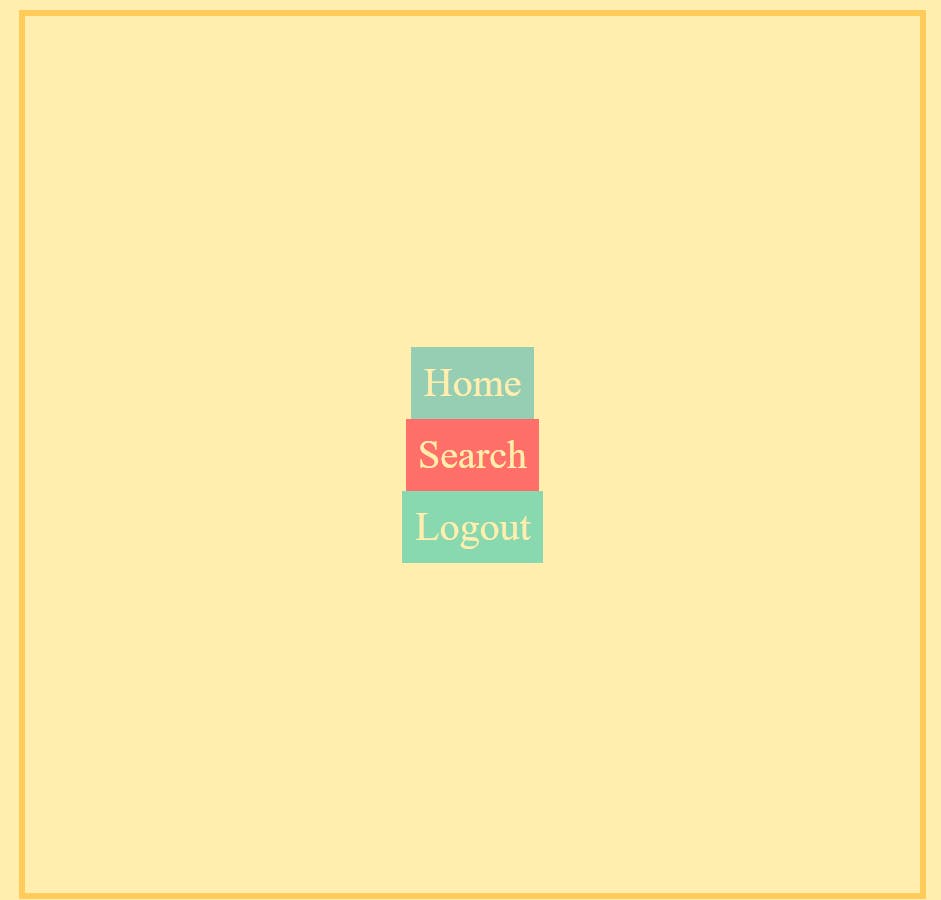
c) justify-content: center, all items will stick at the center of the Main Axis.
d)justify-content: space-around, it provides enough space between each item on the Top and Bottom (items don't stick at any ends of the Main axis).
e)justify-content: space-between, it provides an equal space between each item (items stick at the ends of the Main axis).
f)justify-content: space-evenly, it provides even space between the items and the end of the Main Axis on both sides.
NOTE:
We can place all the items together in a particular location (with flex-start, center, and flex-end), or we can spread them apart (with space-between, space-around, and space-evenly).
1.2) Align Items
As usual, we use the align-items property to align items across the Cross Axis. In the case of the flex-direction: column, the Cross Axis is from Left to Right (horizontal) :
NOTE: height of the HTML, body, and container is 100%.
Now applying align-items properties
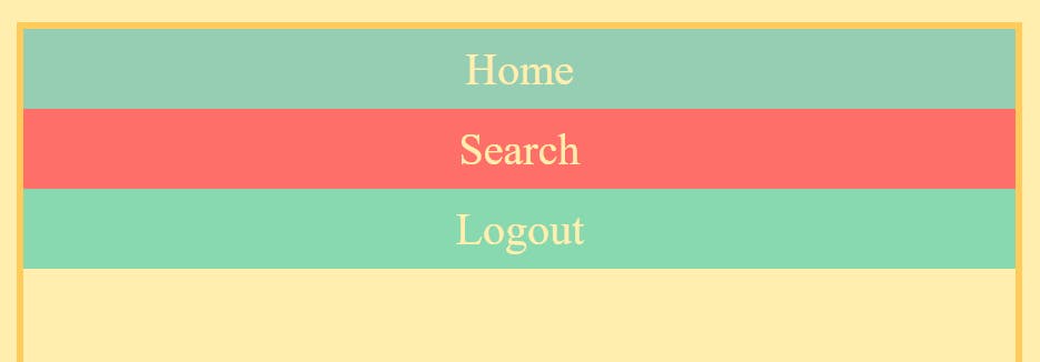
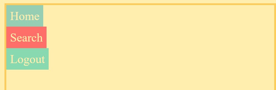
a) align-items: stretch, by default, makes all the items stretch across the Cross Axis, we can see this by increasing the height of the container with height: 100%
b)align-items: baseline, makes all the items align along their content's baseline.
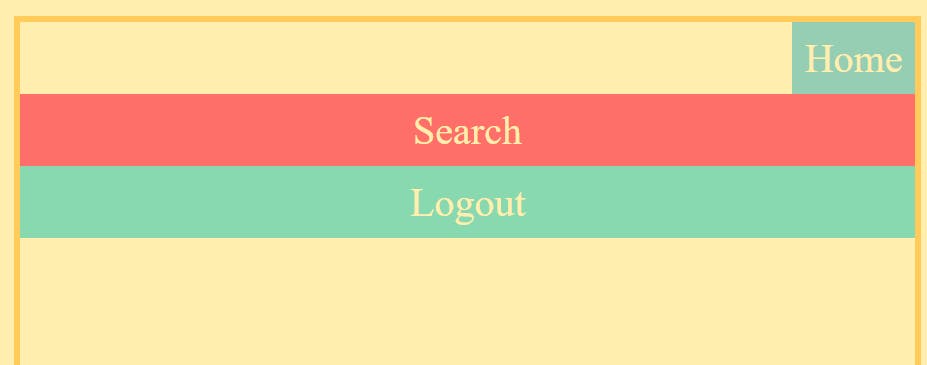
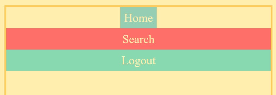
c) align-items: flex-start, all items stick to the start of the Cross Axis and only take as much height as they are required to display their content.
d) align-items: flex-end, all items stick to the end of the Cross Axis and only take as much height as they are required to display their content.
e) align-items: center, all items stick at the center of the Cross Axis.
2) Positioning Items Individually
2.1) Along the Cross Axis
align-self property allows us to change the alignment of a specific item along the Cross Axis.
.container{
    display: flex;
    flex-direction: column;
    height: 100%;

}
.home{
    align-self: flex-start; /*flex-end, center, stretch, baseline */
}
NOTE: container height: 100%
I am going to modify the Home item by targeting its class '.home' with all types of align-self properties. The align-self has all the same values as align-items. They change the same thing. align-items is a convenient shortcut that automatically sets the alignment on all the items at once.
Items take only as much space as they are required to display their content.
a) align-self: flex-start, aligns the item to the start of the Cross Axis.
b) align-self: flex-end, aligns the item to the end of the Cross Axis.
c) align-self: center, aligns the item to the center of the Cross Axis.
the same applies to align-self: stretch and align-self: baseline for the Home as mentioned in the align-items property.
2.2) Along the Main Axis
For flex-direction: row, we used margin-left and margin-right properties, here in flex-direction: column to position items individually along the Main Axis we use the margin-top or margin-bottom property by targeting it by using the respective class names of the items.
a) margin-top: auto, places an element at the end of the Main Axis (puts a margin from the top side)
.logout{
    margin-top: 100px;
}
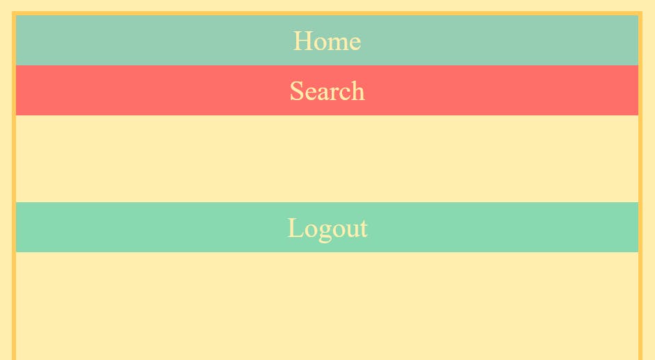
b) margin-bottom: auto, places an element at the start of the Main Axis (puts a margin from the bottom side)
.container{
    height: 100%;
    display: flex;
    flex-direction: column;
    justify-content: flex-end;
}

.home{
    margin-bottom: 100px;
}
Other values of margin-top or margin-bottom can also be used such as in px or rem
NOTE: The margin-top and the margin-bottom property also affects other items besides the item on which they are applied.
.search{
    margin-top: 200px;
}
As you can see margin-top: auto makes Search at the move 200px from the start of the Main Axis, but since Logout is also after Search, it also gets pushed along the Main Axis.
3) Centering: The Game Changer
Here again, both justify-content: center and align-items: center can be combined in the parent container to give the most satisfying feeling of centering an item.
.container{
    height: 100%;
    display: flex;
    flex-direction: column;
    justify-content: center;
    align-items: center;
}
Pure Magic, but this spell of justify-content: center and align-items: center in flex-direction: column hardly comes in use with web designs. But you never know, when it'll come in handy.

Be sure to collect as many of these quick shorthand spells in your journey of CSS.
In the next Blog, we shall wrap up the Flexbox Series with some advanced properties linked with Flexbox that are crucial for the responsiveness of your container's layouts. See you there