

If that's the first thing popping into your mind after hearing Flexbox, we do have the same sense of broken humour. Lol !!!
It's much more amazing and interesting than a cardboard box flexing its muscles.
And in this Flexbox Blog series, I have simplified CSS Flexbox for anyone who wants to get started with Flexbox or brush up their past knowledge with appropriate code snippets and graphic visualizations.
Before starting anything new, it's a good practice to build a strong foundation of basics before we take our learning to a higher level.
Getting started with Flexbox
Here in Part 1, I have shed light upon the basics including what Flexbox is, the advantages of Flexbox, and some important things to keep in mind before starting one's journey in Flexbox.
1) What is Flexbox?
Flexbox in CSS is a powerful layout mechanism designed for laying out content (a group of items inside a container) in one dimension with dynamic space distribution and alignment properties.
When we truly understand how Flexbox works, we can build responsive layouts that respond automatically, rearranging themselves as needed.

2) Advantages of Flexbox
Flexbox Has Many Exciting Features, As It
2.1) Reduces Code Complexity
If you have been trying the ancient way of positioning elements by CSS using the position property such as fixed, absolute, or relative and for centering multiple elements using the margin property, you know how painful it is. Writing multiple lines of CSS in both the parent container and the item elements and keeping track of it becomes difficult during large projects.
With Flexbox, it happens within a few lines of code. The reason Flexbox was created in the first place was for this very reason, to allow us to achieve the complex layouts we already create, in as little as one declaration.
2.2) Responsiveness
can be laid out in any flow direction (leftwards, rightwards, downwards, or even upwards!)
can have display order reversed or rearranged at the style layer (i.e., visual order can be independent of HTML definitions )
can be laid out linearly along a single (main) axis or wrapped into multiple lines along a secondary (cross) axis.
can “flex” their sizes to respond to the available space.
can be aligned concerning their container or each other
can be dynamically collapsed or uncollapsed along the main axis while preserving the container’s cross-size.
2.3) Supported by a wide range of browsers
- Flexbox in its early days of launch only worked in a few selective major browser versions. Over the years with multiple updations, it became widely accepted and is now supported by a wide range of browsers, from local to major ones.
2.4) Easy to get started
- Beginner developers don't need to have any in-depth knowledge of margin and padding before getting into Flexbox. Anyone can get started with CSS Flexbox easily and
3) Flexbox Basics
3.1) Flex Container and Flex Items
To understand Flexbox one must first understand what a Parent Container and child items are
Take a look at the code snippet below
<html>
  <head>
    <title>Flexbox Layout</title>
  </head>
  <body>
    <nav> class="container">
      <div class="home">Home</div>
      <div class="search">Search</div>
      <div class="logout">Logout</div>
    </nav>
  </body>
</html>
A container in general is something that can store multiple things inside it. Here the <nav> element with class="container" which contains multiple divs, acts as a Parent Container. In terms of Flexbox, it refers to a Flex Container. A Flex container isn't limited to just nav, it can be an <div> element also, or a <ul> or <ol> (lists) that contain various list items (li). Anything that can hold multiple elements inside it can act as a Flex Container.
These individual <div> inside the Parent Container are known as Child Elements or Flexbox items. For a <ul> or <ol>, the <li> are child elements.
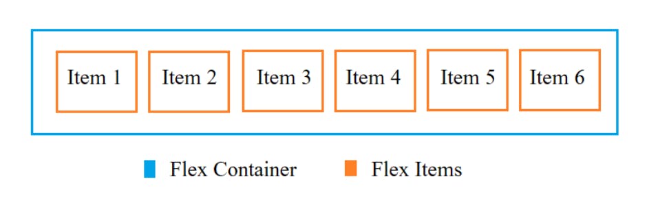
From now on whenever we refer to Container it will refer to Flex Container and Items for Flex items.
To turn a Container into Flexbox we add display: flex to the class of the Container, here the class of Flexbox Container nav is '.container'
.container {
display: flex;
}
You can see the elements Home, Search and Logout space from left to right. That's the default case for a Flexbox, items take space from left to right.

Also, a Flexbox has the default display property as a block, ie the Container takes up the entire width of one's Browser screen.
3.2) Flex Direction
A Flexbox Container always has a direction that is modifiable.
.container {
display: flex;
}

By default the flex-direction is set to row (horizontal), starting from LHS to going RHS. That's how the above items are placed from left to right. So there isn't any need to add flex-direction: row to the container.
By setting flex-direction: column, you will get the following result
.container {
display: flex;
flex-direction: column;
}

Now the items are stacked on top of each other. From top to bottom, the order goes Home, Search, and Logout as defined in the HTML.
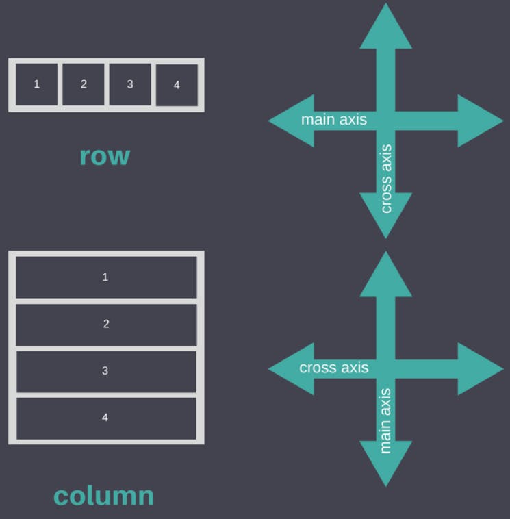
3.3) Flexbox Axes
There are two axes when it comes to Flexbox, the Main Axis and Cross Axis. These play an important role in the positioning of items inside the container with adequate spacing and all responsiveness depends upon these two axes.
Note: Main Axis and Cross Axis are flex-direction dependent.
For default flex-direction: row, where items are placed left to right, the Main Axis goes from Left to Right (horizontal) and Cross Axis goes from Top to Bottom (vertical).
For flex-direction: column, where the elements are stacked from top to bottom, the Main Axis goes from Top to Bottom (vertical) and Cross Axis goes from Left to Right (horizontal).
Here's a quick representation
There are two more flex-direction properties row-reverse and column-reverse, which shall be discussed in upcoming parts.
4) Conclusion
Flexbox - a CSS layout mechanism to implement responsive web layouts.
Advantages - reduces code, responsive, supported on multiple browsers.
Flexbox Container - parent container which is turned in Flexbox by setting display: flex in its class
Flexbox Items - child elements of Flexbox container upon which multiple Flexbox properties apply.
Flex Direction - default row (items placed left to right), column (items stacked from top to bottom).
Flex Axes - consists of Main and Cross Axis that govern the majority of Flexbox properties, for row direction (Main Axis - L to R, Cross Axis T to B) and column direction (Main Axis - T to B, Cross Axis L to R).
This was all for Flexbox Part 1, where we got into what Flexbox is and the basics related to it. In the next part, we will dive a little deeper into the properties related to flex-direction: row, the default direction, which is used more frequently in designing responsive layouts.