


Welcome back to Simplifying CSS, in this final part of the blog series, we shall discuss some advanced concepts revolving around Flexbox which may come in handy while developing your responsive layouts.
1) Growing and Shrinking
1.1) Flex Property
The CSS flex property works on items of the container. It allows one to set the width of the items concerning the container (in other words makes the flex items responsive when the size of the flex container changes).
<html>
    <head>
        <link rel="stylesheet" href="basic.css">
        <link rel="stylesheet" href="index.css">
    </head>
    <body>
        <div class="container">
            <div class="home">Home</div>
            <div class="search">Search</div>
            <div class="logout">Logout</div>
        </div>
    </body>
</html>

.container{
    display: flex;
}
.container > div {
    flex: 1;
}
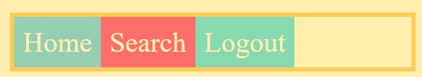
When the size of the container is made to change, each item occupies the space equally (they expand or shrink equally when the container size changes)
When container expands

When container shrinks

NOTE: In CSS .flex_container class > .flex_items (or specific flex items) is more specific and gets a higher priority while using flex
Another approach is to make a single item do all the flexing (growing or shrinking) and other items are of fixed width and adjust according to it)
.search{
    flex: 2;
}
When container expands

When container shrinks

Here search item takes twice as much space (grows or shrinks) as other items and other items; home and search adjust according to the search when the size of the container is changed.
flex is a short-hand property for flex-grow, flex-shrink, and flex-basis.
In CSS setting flex: 1; sets flex-grow: 1, flex-shrink: 1, flex-basis: 0; or flex: 1 1 0;
1.2) Flex-basis
flex-basis sets the basic width of the container, if the width of the container is enough for the items inside it, the items will occupy the desired width mentioned and on further increase, they will remain the same.
Simply put, In a Flex row, the flex-basis does the same thing as the width. The flex-basis does the same thing in a Flex column as the height.
.container {
  display: flex;
}

.home {
  flex-basis: 200px;
}

.logout {
 flex-basis: 200px;
}
Here if the flex container width is 400px or > 400px, both Home and Logout will be 200px and won't expand even a bit now and space will be left in case of >400px. As shown below
when the flex container's width is 400px

when the flex container's width > 400px

As a friendly reminder, flex-basis serves the same purpose as width. We'll use flex-basis because it's conventional, but we'd get the same result if we used width!
1.3) Flex-grow
By default, elements in a Flex context will shrink down to their minimum comfortable size along the primary axis. This often creates extra space.
flex-grow decides how much of the extra space should be distributed to the flex items with the growth of the flex container.
The default value for flex-grow is 0, which means that growing is opt-in. If we want an item to take up any extra space in the container, we need to define it.
Ex-1
.home {
  flex-grow: 1;
  flex-basis: 200px;
}

.logout {
  flex-grow: 1;
  flex-basis: 200px;
}

since flex-grow: 1 to both Home and Logout, the extra space will be distributed evenly with grow and shrink of the flex container.

Ex-2
.home{
    flex-grow : 0
    flex-basis: 200px;
}
.logout {
  flex-grow: 1;
  flex-basis: 200px;
}

Now Logout will cover the extra space with the growth and shrink of the flex container.

NOTE:
flex-grow of flex items work in sync with each other
if both
flex-grow: 0- extra space won't be occupied by any flex items.if both
flex-grow: 1 or the same value- extra space will be occupied evenly by flex items.if one
flex-grow: 0and Anotherflex-grow: non-zero- extra space will be taken by the non-zero flex item.if one
flex-grow: non-zeroand Anotherflex-grow: higher non-zero- the extra space will be taken by a higher flex item and it will expand at a better rate.
1.4) Flex-shrink
flex-shrink specifies the shrink factor which determines how much the flex item will shrink relative to the rest of the flex items in the flex container when there isn’t enough space on the row.
The default value of flex-shrink: 1, flex items shrink equally.
Ex-1
.home {
  flex-shrink: 0;
}

.logout {
  flex-shrink: 0;
}
When the width of the container is changed.

NOTE: flex-shrink of flex items work in sync with each other
if one
flex-shrink: 0and anotherflex-shrink: non zero- non-zero flex item does all the shrinkingif one
flex-shrink: non-zeroand anotherflex-grow: higher non-zero- higher non-zero will shrink at a faster rate wrt to the lower rate.
Ex-2
.home {
flex-grow: 0;
flex-shrink: 5;
flex-basis: 200px;
}

.logout {
flex-grow: 0;
flex-shrink: 1;
flex-basis: 200px;
}

Here Home shrinks 5 times faster concerning Logout.
flex-shrink: we can think of it as the “inverse” of flex-grow. They're two sides of the same coin:
flex-growcontrols how the extra space is distributed when the items are smaller than their container.flex-shrinkcontrols how space is removed when the items are bigger than their container.
This means that only one of these properties can be active at once. If there's extra space, flex-shrink has no effect, since the items don't need to shrink. And if the children are too big for their container, flex-grow has no effect, because there's no extra space to take.
2 ) Gap
One of the biggest Flexbox quality-of-life updates in recent years has been the gap property: the gap allows us to create space between each Flex child.
gap is a relatively new addition to the CSS, but it's been implemented across all modern browsers since early 2021.
The gap property is used for the flex container.
.container {
  display: flex;
  gap: 50px;
}

Here, a gap of 50 px is applied to all the items present in the flex container, ie Home, Search and Logout.
3) Order
One can change the order of flex items inside the flex container via the order property.
By default order: 0, ie flex item is placed according to their definition in HTML.
if order > 0, eg(1), the flex item moves to the end of all flex items (across the Main Axis)
if order < 0, eg (-1), the flex item moves to the start of all flex items (across the Main Axis)
NOTE: order of flex items also work in sync with each other
.home {
  order: 1;
}

.search {
  order: 0;
}

.logout{
  order: -1;
}
Here Logout is at first, Search is at second and Home at third (last).

Final Note
At last, we have covered all the important properties of CSS Flexbox required for designing and developing responsive layouts. I haven't covered all the properties of CSS Flexbox in the blog series but focused on the vital and most used ones from the basics to the advanced ones.
So now with the gained insight into the power of Flexbox, it's your responsibility to explore and master this power by building projects.

Thank you for making it this far. If you like reading my blogs and feel that it's genuinely worth your time and that you have gained some insights from them. Do drop some love and follow me for similar content in the future.
You can also check out my other blogs at shashankkumar.hashnode.dev
See you next time. Till then
Be Curious, not Judgemental :)